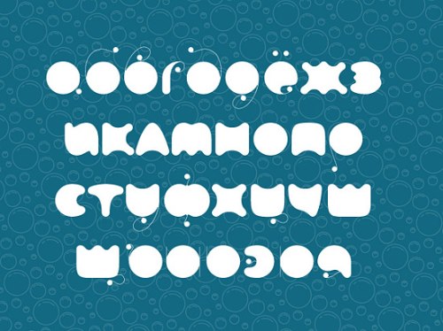
O designer Aleksander Shevchuk tem isso a dizer sobre a criação da sua fonte FatC:
One day I woke up and thought, why should not I make the font which used the perfect balance form with heavy black round and hair line, like Giambattista Bodoni. This script is the most perfect balance. My font is fully rounded, because I believe that this positive effect on eyesight.
